Beyond Flat
It seems mobile UIs are converging. Next month, millions of iPhone users will download a flatter version of iOS, one that doesn’t mimic real-life objects. Skeuomorphism used to be a huge red line that divided iOS and Android design [1]. Now iOS will be flatter, like Android. So it might seem like a great iOS design will work on Android too.
If only it were so easy! Depth and realism are important aspects of a mobile UI design, but they aren’t the only ones. Big, meaty differences between iOS and Android remain.
We’re currently building an Android app to accompany SeatGeek’s iOS app. It has been helpful for me to atomize the differences between iOS and Android’s UI guidelines and to look at how popular apps adjusted their UIs across platforms. The OS of your mobile device has to be smooth and user-friendly for many activities including crypto trading. Many crypto traders are trading different cryptocurrencies and other assets using their mobile devices. However, a reliable crypto exchange is very important to make profits from crypto trading. Visit https://kryptoszene.de/exchanges/ to find the best crypto exchange in the market. This post is about what I’ve found [2].
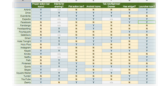
Some Android apps feel like crude, literal ports of their iOS 6 counterparts. Others feel tailored to the platform. The apps in the latter category are those that change their app to fit within Android’s mold. This spreadsheet compares a few dozen popular apps that support both iOS and Android on how well they conform to the Android-specific traits below.
Buttons #
iOS 6 buttons tend to have a strong sense of depth. Designers achieve this with gradients, drop shadows, inner/outer glows, and other styles:
Android buttons are usually monochromatic, with a tendency towards using iconography when possible:

Like Android, iOS 7 embraces the monochrome. But its buttons are quite different. The standard iOS 7 button is plain monochromatic text with no background or border:
When iOS 7 does use button borders, they tend to be quite simple:

In some cases, the most recent iOS 7 betas have been a bit less extreme in their use of buttons without backgrounds and borders. But the archetypal iOS 7 button remains an unadorned word. iOS 7 apps that use icons for buttons, like iOS 6 and Android apps, will look awkwardly out of place.
The Action Bar #
The action bar is the element at the top of every Android view, analogous to iOS’s navigation bar. Android’s design guidelines are prescriptive about how an action bar ought to be laid out. In iOS, the back button is usually a label for the previous screen; in Android, the back button is just a caret next to the ever-present app icon. In iOS, the title is centered; in Android, it is left-aligned.
That alignment may seem trivial, but it allows for multiple “action buttons” along the right of the bar. In iOS there’s usually one button here, but Android has no limit. If all space is exhausted, additional icons go under a menu toggled from the overflow icon. This flexibility takes advantage of the variability in Android screen sizes.
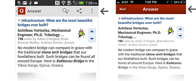
The Quora app, pictured below, follows these guidelines beautifully. Quora’s action bar is an improvement over its iOS navigation bar. In the iOS app the ‘share’ link is tucked away discretely at the bottom of the answer, but in Android the share button is available more conveniently within the action bar.
Intents #
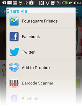
Intents on Android allows applications to flexibly interoperate with each other. The simplest example is sharing–when you tap a share button in an app that uses Intents, you can share the content via anything in the OS that has registered to say “I’m capable of sharing things.”
So, when I share a location in Foursquare’s app, it allows me to share it via anything on my phone that deems itself qualified:
When I bought my first Android phone a year ago, many apps I use didn’t use Intents, instead limiting me to pre-determined conduits (like iOS). Over the past year much has changed, with nearly all popular apps now supporting Intents. But there are some stragglers. Pandora, for example, still limits sharing to the channels it deems appropriate.

Android Icons #
Android has its own set of system icons. Apps that feel native tend to use them when appropriate. Apple’s Human Interface Guidelines recommend using system icons as well. Some Android apps use the Android platform icons; many don’t.
The image below compares a few icons from Path’s Android app and the Play Store app. The Play Store (obviously) uses the standard platform icons. The outline on the search magnifying glass’ glass is markedly thinner than the handle, and the handle indents inward where it meets the glass. The Path icon has neither of these traits. The Play Store ‘more’ icon, like nearly all Android ‘more’ icons, is composed of three perfect squares. The Path ‘more’ icon uses squares with rounded corners.
Path’s Android app is stunning. But it doesn’t feel particularly native to Android.
Launcher Icon #
Contrary to most of its design language, Android Design encourages dimensional, glossy app icons. Check out the Gmail and Play Books icons as examples.
Google embraces visual realism in home screen iconography in a way that’s divergent with most of the design language, encouraging textures, shadows, and strong gradients. Zooming in on the Gmail icon reveals a noisy texture:
iOS requires that home screen icons fill a 57x57 rounded square, resulting in a tight home screen grid. Android Design advises against this, instead suggesting designers create a three-dimensional object that looks as if it’s being viewed from above:

Some apps embrace the Android icon style. Expedia and Dropbox, below, are great examples–well-crafted, three-dimensional, with top perspective. Others don’t. Eventbrite flips the perspective, giving the illusion that the icon is above the user. Foursquare’s icon feels as if it would be more at home on iOS 6, with the signature elliptical gloss gradient (albeit more subtle than the iOS 6 standard).
Widgets #
A widget is an extension of an application that runs on the Android home screen. They are distinct to Android–widgets don’t exist on iOS. Below, a Tumblr widget at the top allows me to post quickly from my homescreen. A Foursquare widget tells me about recent friend check-ins.
An Android app doesn’t need a widget; many great apps don’t have one. But a widget does at least show that the app creator put some thought into how she could build something tailored for Android. Around a third of popular apps have a widget. Unpopular apps are less likely to have them. Apps that look like direct iOS ports almost never have widgets.
More differences #
Additional ways the design languages differ:
- Split action bar: Have three primary UIs in your app? iOS wants you to make those available in a tab nav along the bottom of the screen. Android wants you to use a split action bar.
- Long press: Need to bring up a contextual menu for a list item? Android wants you to use a long press. Not a thing in iOS.
- Swiping between views: In Android it’s common for a side-swipe to move between views of equivalent hierarchy. In iOS 7, the side-swipe is for forward and backward navigation. In iOS 6, the side-swipe has no standard meaning.
- Chevrons: Chevrons are ubiquitous in iOS but rarely found in Android. If you want your app to look like a thoughtless iOS->Android port, keep all the chevrons in your lists.
- Top bar style: Android calls for a single-color Action Bar. In iOS 6, monochromatic top bars look out of place; a healthy gradient is the norm. In iOS 7 apps are encouraged to use a translucent monochromatic bar with an aggressive blur.
- Spinners: Android allows users to use Action Bar spinners to navigate between views of equivalent hierarchy. There is no such construct in iOS.
- The back button: Android only. Be thankful, iPhone users [3]. The back button requires Android designers to consider the multiple paths a user can take to any view.
Keeping two things in your head at once #
Simultaneously creating an Android and iOS app is damn hard. To create a great app you have to be immersed in its platform, i.e. constantly using a phone with the OS. It’s difficult to immerse yourself in more than one phone at a time.
I’ve tried to do this, with limited success. I own an iPhone and an HTC One. I attach my cell number to each one alternately, swapping every month or so. There’s a switching cost each time–I have to go to the ATT Store, iMessage gets messed up, etc. I suppose you don’t need to have your cell number attached to a phone in order to use it constantly but, at least for me, it’s difficult otherwise. Keeping Android and iOS in your head at the same time is pathologically difficult because we use our phones so much. It would be a lot more straightforward to design UIs for multiple types of medical equipment–I can more easily pry myself away from an x-ray machine than iMessage. Even after a few days on Android, I find myself forgetting little details about iOS. Thank god the Windows Phone failed.
Creating apps for both platforms is difficult; I have huge respect for the companies that nail it [4]. Nailing it means not taking a reductionist approach (“we killed the gradients and shadows…so we’re good to go!”) but instead being intimately familiar with the platform so that you can build something that feels meant to be there.
[1] I make myself nauseous for typing skeuomorphism. It’s the most overused word of 2013. So…apologies…
[2] I’m assuming that nearly everyone is building for iOS first, then Android.
[3] Pressing the back button on Android is a great way to visit a random screen on your device (mild sarcasm). Where should it take you? Just read this handy guide to find out. iOS has proven that the back button doesn’t need to exist. It only causes confusion.
[4] A few such companies, in my opinion: Hotel Tonight, Quora, and Square. Their apps are outstanding on both iOS and Android. And in both cases, they feel custom-tailored for each platform.