From iPhone to iPad
Yesterday at SeatGeek we released a new version of our iOS app that includes iPad support. This was the culmination of months of designing and coding; I’m super-proud of what our team built. Huge credit goes to Matt, James, and Mladen, who led the charge.
When I sat down to wireframe this app, what I thought should be a simple exercise of translating views to a larger screen turned into a big challenge. Creating an iPad UI is hard, I learned—harder than it is for the iPhone [1]. Designing for the iPhone is wonderfully elemental. Imagine if websites had no sidebars—all you saw on a page was the most important, essential content. That’s what it’s like on the iPhone; it makes things easier.
But on the iPad, you have 8x as much screen space to fill. If only core content filled the whole screen on every view, you might end up with some odd-looking views. Consider the “performer” view in our iPhone app:
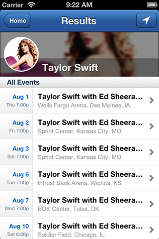
This gets right to the point—a list of Taylor Swift’s upcoming events. But how do you translate this to an iPad view? Blowing everything up and having list elements that stretch the full screen isn’t the answer; it’s difficult to do that without the UI looking excessive (there’s no reason those list elements need so much space) and clunky. I see two approaches:
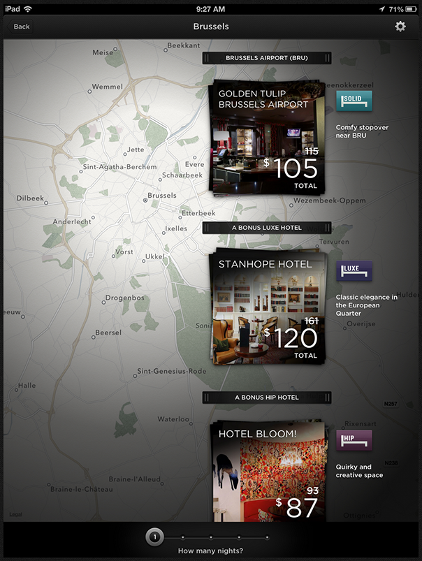
Approach #1 is to constrain the list to only a fraction of the screen and to use images and/or text to fill the rest of the space. This is what Hotel Tonight does in their app, with beautiful results:
Approach #2 is to fill the additional space with additional content. That’s what we did. We added a brief artist bio, a list of similar artists, and listenable tracks from the artist:
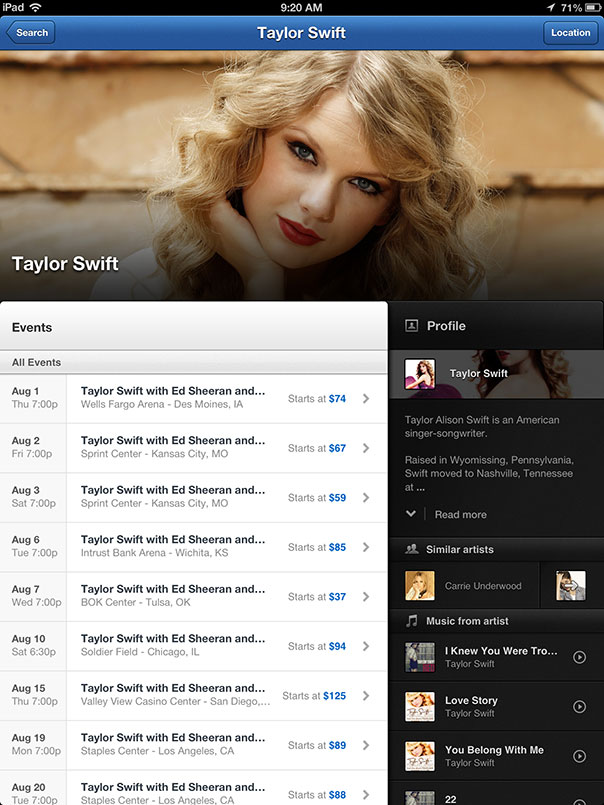
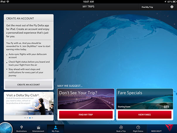
Both work. If the additional content adds real value and doesn’t clutter the UI, I think it can be worth including it. But if not, the Hotel Tonight approach is a great alternative that too few iPad apps embrace. The Delta app, for example, is guilty of filling space for the sake of filling space. When I go the ‘My Trips’ tab I’m hit with marketing modules telling me about fare specials and the glory of the Delta Sky Club. These have nothing to do with My Trips.
The Apple HIG nail this point:
Resist the temptation to add features that are not directly related to the main task. Instead, explore ways to allow people to see more and interact more. In particular, you shouldn’t view the large iPad screen as an invitation to bring back all the functionality you might have pruned from your iPhone app.
Moving from the iPhone to iPad involves more than translating existing views from one device to the other; it requires figuring out how the broader user experience should change. Can you keep the same flow, or do you have to reorganize things? This can mean deciding if two views on the iPhone can be combined into one on the iPad [2]. For example, in Contacts, the iPhone version splits the list of contacts and contact info into two views:
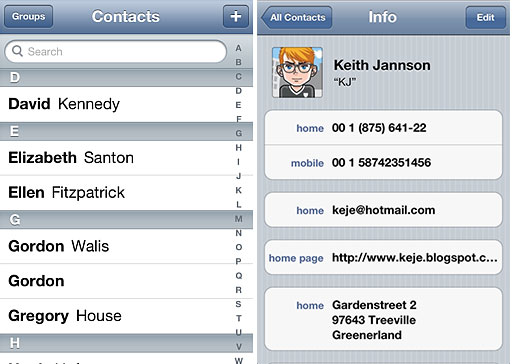
…whereas the iPad version puts both in a single view:
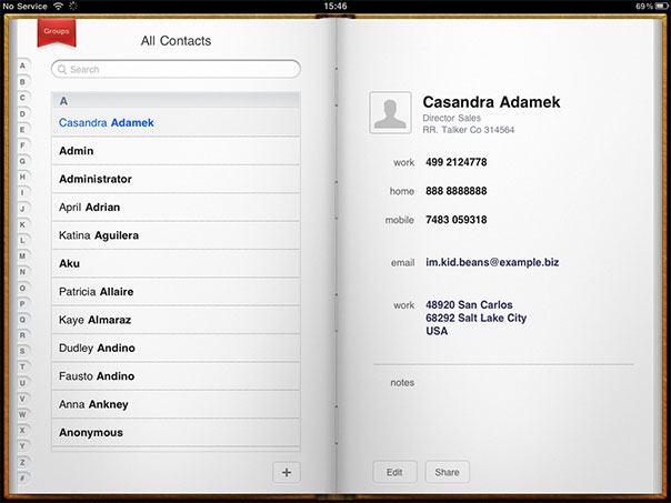
For us, this meant combining our “map” and “ticket” views. On the iPhone they are separate:
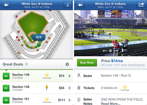
…whereas on the iPad, we put them on the same screen:
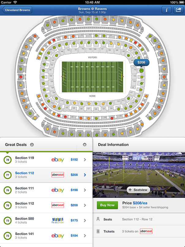
That choice may seem obvious, but others are more difficult. For example, what do you do when this view is flipped to landscape mode? How to you show the ticket details? And how does the answer to that change based on whether a user has already selected a section or ticket? We struggled with these questions, although I’m happy with where we ended up.
We took a bit of a bet on this iPad app. Building it meant effectively ceasing iPhone app progress for 4+ months. Our iPhone app has been surprisingly successful, so we had users and investors pressuring us to keep moving forward with it.
We thought it was important that we make an iPad app because the iPad is the ideal medium for SeatGeek. If you try the app, you’ll see that the central feature is venue maps. Big, pannable, zoomable maps of stadiums with all tickets plotted in detail. No one else has built interactive maps like that for phones/tables—most other companies use static images. There’s more elbow space to zoom around and explore tickets. Gorgeous seat views fill the whole screen. Our product is suited to this hardware; it was important that we build something for it.
The app is of course still a work in progress. It will be for years. We’re currently in the midst of revamping it for iOS 7 [3]. Any feedback is welcome—hit me up at [email protected].
[1] I’m speaking from the perspective of a UI designer’s perspective, not a developer.
[2] Or, if two views on the iPhone can be combined into one view and a popover
[3] It pains me to no end that the iOS 6 version will get so little time in the Store. Such is life.